Abhinav Kumar Dwivedi

Product leader tailored for the new internet. Building digital products that matter.

Sitemap

  • Index
  • Projects
  • Blog
  • About

Socials

  • LinkedIn
  • x
  • GitHub
  • Email
© 2026 All Rights Reserved
New Delhi,India / Remote

CashVibe: Designing Clarity in Personal Finance

A clarity-first personal finance product that helps users understand where their money stands across apps — without advice, automation overreach, or loss of trust. Focused on awareness before discipline in a regulated fintech context.

0%

CashVibe: Designing Clarity in Personal Finance

A clarity-first personal finance product that helps users understand where their money stands across apps — without advice, automation overreach, or loss of trust. Focused on awareness before discipline in a regulated fintech context.

View Prototype
Product Manager2025
CashVibe: Designing Clarity in Personal Finance
01

The Challenge

Salaried users often overspend without realizing it. Their spending is spread across multiple apps, and cashless transactions feel painless in the moment -there’s no single place showing what’s been spent and what’s actually left.

The problem surfaces late. For many, it’s at the end of the month or right before bill payments, when a sudden balance drop triggers the realization:

I didn’t realize I spent this much.

By then, clarity comes too late.

Each finance app shows accurate data in isolation, but fragmentation forces users to reconcile everything themselves. Over time, many stop tracking altogether - not because they don’t care, but because staying aware feels like work.

This isn’t a problem of income or intelligence. It’s a clarity problem.

02

The Goal

Primary goal
Help users feel aware and in control of their money without actively tracking it.

Behavior change
Shift users from reacting at month-end to knowing how much is safe to spend before spending.

Emotional outcome
Confidence, driven by visibility, not discipline or guilt.

Non-goals

  • Giving financial advice

  • Enforcing hardcore budgeting

These were avoided deliberately. Telling users what to do risks overreach and erodes trust.

Success looked like
Users don’t panic before bill payments.

Failure looked like
Users stop opening the app after a few months.

Overview

CashVibe started from a simple but uncomfortable truth: people don’t lose control of their money because they’re careless, they lose control because they can’t clearly see what’s happening.

In my research, users were juggling four or five different apps: bank apps, UPI, credit cards, investments; then stitching everything together in Excel. Not because they liked tracking, but because no single product gave them a complete picture. This led to a recurring pattern: people felt fine day to day, until suddenly realizing they had overspent without noticing. Clarity always came too late.

The obvious fintech response is to push discipline- budgets, limits, AI advice, automation. I deliberately chose not to go down that path. My judgment was that discipline cannot exist without clarity, and advice without trust breaks confidence, especially in a regulated domain like personal finance in India.

CashVibe focuses on solving the problem at the right layer. Instead of telling users what to do, it provides a trusted, unified, and visually clear view of their finances, allowing awareness to emerge first — and discipline to follow naturally.

This case study explains how I arrived at that belief, the constraints that shaped the product, and the decisions I made to design for clarity before control.

In-Depth Analysis

Context & Constraints

01 — The Context

"Clarity over advice. Trust over speed."

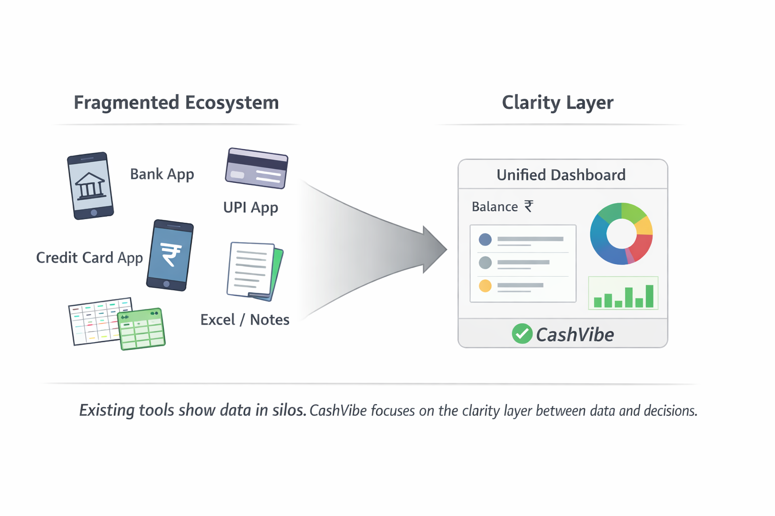
CashVibe was designed for digitally savvy Gen Z users in India who already rely on UPI, bank, and investment apps to manage money. While transactions are frictionless, understanding finances isn’t. Users often stitch information across apps or fall back on Excel and Notes - which demands ongoing manual effort and quickly breaks down.

Trust is the baseline expectation. In a high-stakes, regulated domain like finance, users are quick to disengage from products that feel unsafe, opaque, or overly prescriptive.

The biggest constraint was regulation. Early on, I explored a “Google Maps for finance” idea - showing users where they are, where they want to go, and possible paths forward. In India, however, prescriptive financial guidance requires licensed advisors. Acting like a financial coach was out of scope.

This forced a clear tradeoff: speed vs trust. I chose trust. The product had to stay descriptive rather than prescriptive, focusing on clarity and visibility instead of telling users what to do.

Key Insights

Market: India, UPI-first, digitally finance-savvy Gen Z
Existing behavior: Multiple apps + Excel/Notes as a workaround
Primary constraint: Regulatory limits on financial advice
Key tradeoff: Speed vs trust
Design shift: Coach → clarity layer

The Product Approach

Stage 01

Problem framing

I started by understanding how people actually manage money, not how finance apps expect them to. I intentionally avoided studying investment strategies or financial theory early on, because the problem wasn’t about returns — it was about awareness breaking down in daily life.

1
Stage 02

Behavior-first research

Instead of relying on opinions, I focused on observable behavior. Users repeatedly showed workarounds like Excel sheets, Notes, and screenshots. These signals mattered more than feature requests — they revealed where existing products stopped helping.

2
Stage 03

Insight prioritization

Across interviews and patterns, one insight stood out: Automation doesn’t help if users don’t trust the system behind it. More features wouldn’t fix the problem if users didn’t feel safe relying on the output.

3
Stage 04

Tension identification

At this point, the core tension became clear: financial coach vs clarity layer. A coach implied guidance and recommendations. A clarity layer focused on visibility and understanding. Given regulatory limits and trust concerns, these two paths couldn’t coexist.

4
Stage 05

Direction selection

I rejected contextual guidance and coaching. Prescriptive insights would have crossed regulatory boundaries and risked breaking user trust. I also avoided gamification — it drives short-term engagement but distracts from clarity. I chose to design for clarity first, treating the product as a neutral layer between financial data and user decisions.

5

Decisions That Shaped the Product

Decision 01

Anchor the product on a unified dashboard

Users were juggling multiple finance apps and relying on Excel just to understand where they stood. Leading with AI or workflows felt tempting, but risked adding another layer of complexity.

Selected Path

The Decision

I anchored the product around a single unified dashboard that acted as the source of truth.

Outcome & Impact
Faster understanding at a glance; reduced cognitive load
Less “wow factor” compared to AI-first demos
Immediate clarity over feature-driven engagement
Paths Not Taken
Assistant-first interface
Rejected

Make AI/chat the primary way users interact with their finances.

Why:Implied advice and authority too early, increasing trust and regulatory risk.

Alert-led workflows
Rejected

Proactively notify users about spending and balances.

Why:Reactive by nature and added noise without improving baseline clarity.

Decision 02

Don’t make the assistant the primary interface

AI assistants are increasingly common in fintech, but money is a trust-sensitive, regulated domain. Users are cautious about systems that “talk back” with authority.

Selected Path

The Decision

Keep the assistant supportive, not central to the experience.

Outcome & Impact
Preserved neutrality and user agency
Reduced perception of “AI intelligence”
Trust and restraint over novelty
Paths Not Taken
Chat-first experience
Rejected

Let users manage finances primarily through conversation.

Why:Created expectations of advice and decision-making the system couldn’t safely meet.

Decision 03

Stay descriptive, not prescriptive

Users wanted guidance, but prescriptive advice is heavily regulated and often perceived as judgmental or biased.

Selected Path

The Decision

Show users their financial reality clearly, without telling them what actions to take.

Outcome & Impact
High trust, compliance-safe, respectful experience
Slower behavior change for some users
Long-term confidence over short-term correction
Paths Not Taken
Recommendations and next-step advice
Rejected

Suggest what users should do to improve finances.

Why:Risked regulatory overreach and breaking trust.

Hard budgets and limits
Rejected

Enforce discipline through strict rules.

Why:Felt controlling and mismatched users’ emotional relationship with money.

Decision 04

Choose hybrid automation over full automation

While automation reduces effort, users expressed discomfort with black-box systems handling their money.

Selected Path

The Decision

Adopt a hybrid model — automate data aggregation, leave interpretation to users.

Outcome & Impact
Balanced convenience with control
Slightly more effort than full automation
Transparency over maximum efficiency
Paths Not Taken
Fully automated insights
Rejected

System interprets data and surfaces conclusions.

Why:Reduced transparency and user confidence.

Fully manual tracking
Rejected

User enters and manages everything themselves.

Why:High effort and low retention.

Decision 05

Exclude gamification

Gamification is a common engagement tactic, but finance requires calm and reflection, not dopamine loops.

Selected Path

The Decision

Exclude gamification from the core experience.

Outcome & Impact
Focus stayed on clarity and awareness
Lower short-term engagement metrics
Meaningful engagement over vanity metrics
Paths Not Taken
Streaks and rewards
Rejected

Incentivize engagement through points or badges.

Why:Encouraged shallow usage rather than understanding.

Solution

How CashVibe turns fragmented money into clear awareness

01
Core Feature

Unified Financial Snapshot

See your entire financial position in one place.

The Challenge

Users overspend without realizing it because their money is scattered across apps and there’s no single view showing what’s been spent and what’s left.

The snapshot aggregates balances and activity across accounts and presents a calm, high-level overview. Instead of forcing users to check multiple apps or do mental math, it answers one core question immediately: “Where do I stand right now?”

  • Aggregated balances across sources
  • High-level spend vs save view
  • Designed for glanceability, not deep analysis
Reduces end-of-month balance surprises & decreases reliance on Excel / manual reconciliation (Conceptual outcome based on user research)
Unified Financial Snapshot
02
Enhancement

Financial Health Indicator

Know if you’re on track — without digging into details.

The Challenge

Users feel fine until their balance suddenly drops. There’s no early signal telling them whether they’re drifting off track.

The health indicator summarizes the user’s current position into a simple, easy-to-understand signal. It doesn’t judge or instruct , it reassures or warns gently, helping users sense direction without needing discipline-heavy tools.

  • Simple, neutral visual indicator
  • Contextual, not prescriptive
  • Updates as financial data changes
Helps users recognize issues earlier in the month & encourages proactive awareness instead of reactive checking
Financial Health Indicator
03
Innovation

Cashy (Clarification Assistant)

Understand what’s happening — without being told what to do.

The Challenge

Users struggle to interpret financial summaries and changes, but don’t trust systems that give advice or recommendations.

Cashy acts as an explanation layer, not a coach. It helps users understand changes in their finances, such as why a balance moved or what a summary means - while deliberately avoiding recommendations, predictions, or instructions.

  • Plain-language explanations
  • Contextual clarification
  • No advice, nudges, or actions
Increases user confidence in interpreting their data & reduces confusion without crossing into advice
Cashy (Clarification Assistant)

Outcome & Impact

Simulated Outcome

How clarity-first design changed user behavior and confidence

Project Goal

Help users gain early awareness of their financial position, so they can avoid end-of-month surprises and feel confident about their spending decisions.

User Impact

2 outcomes
User Impact
💬 Qualitative

Earlier financial awareness and reduced anxiety

Users were able to understand whether they were on track earlier in the month, reducing last-minute anxiety and the need to cross-check multiple apps or spreadsheets.

This outcome is based on qualitative research, including interviews and surveys focused on how users track spending and react to end-of-month financial shortfalls. Impact was assessed by mapping solution behaviors against observed pain points rather than live usage data.

Goal Alignment
Primary goal addressed: Early awareness and confidence without active tracking
User Impact
💬 Qualitative

Reduced reliance on manual tracking and app-hopping

Users no longer needed to switch between multiple bank, UPI, and investment apps or maintain Excel/Notes just to understand their financial position. CashVibe became the primary reference point.

This outcome is derived from synthesis of interviews and behavioral observations, where users demonstrated manual reconciliation workflows as a coping mechanism for fragmented financial tools. The solution was evaluated against these behaviors rather than post-launch usage metrics.

Goal Alignment
Primary goal addressed: Reduce cognitive load and eliminate the need for manual reconciliation.
Retrospective

Learnings & Reflection

How this project changed the way I think about building financial products

01

Paradigm Shift

New perspective

Clarity comes before discipline

  • I initially believed finance products should push discipline through advice or rules

  • This project showed me that discipline doesn’t stick without clarity

  • When users understand where they stand, better behavior follows naturally

02

The Surprise

Unexpected discovery

Trust is fragile

  • I underestimated how easily trust breaks in personal finance

  • Even well-intentioned guidance can feel intrusive

  • Restraint builds more trust than intelligence

03

Key Takeaway

Core lesson

Automation vs control

  • Automation reduces effort, but can remove user agency

  • Users don’t want systems deciding for them

  • They want help seeing clearly and deciding confidently

04

Growth Area

Future opportunity

Validate behavior earlier

  • I would validate earlier how much clarity alone changes behavior

  • Focus more on longitudinal impact, not feature depth

  • Delay “smart” capabilities until trust is fully earned

05

Key Takeaway

Core lesson

This project changed how I think about building products — from adding intelligence and control, to earning trust through restraint and clarity.